Browse components
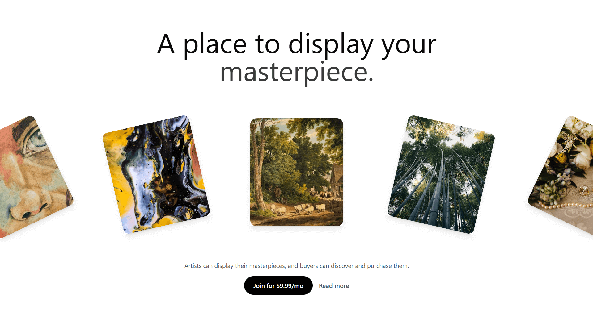
A visually engaging component that displays multiple images in a fanned-out, tilted arrangement. Ideal for portfolios, galleries, or product showcases, this layout draws attention to featured content while maintaining a modern and dynamic aesthetic. Supports hover effects, clickable cards, and customizable spacing.
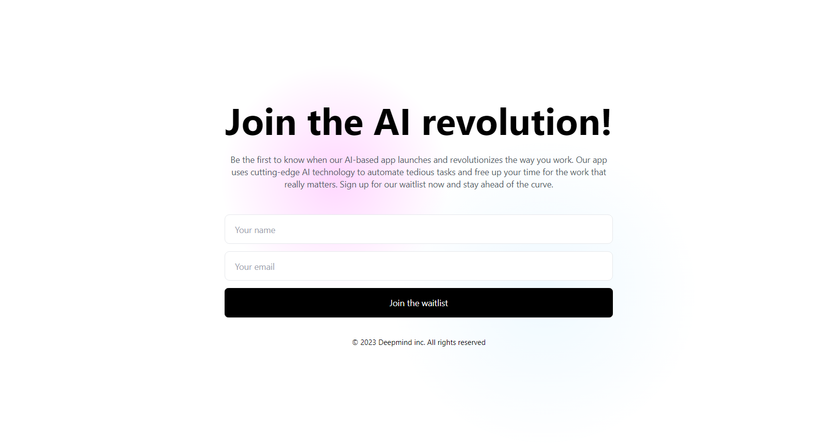
A visually dynamic call-to-action (CTA) button with animated directional icons, enhancing user engagement. Ideal for subscription sign-ups, free trials, and interactive prompts.
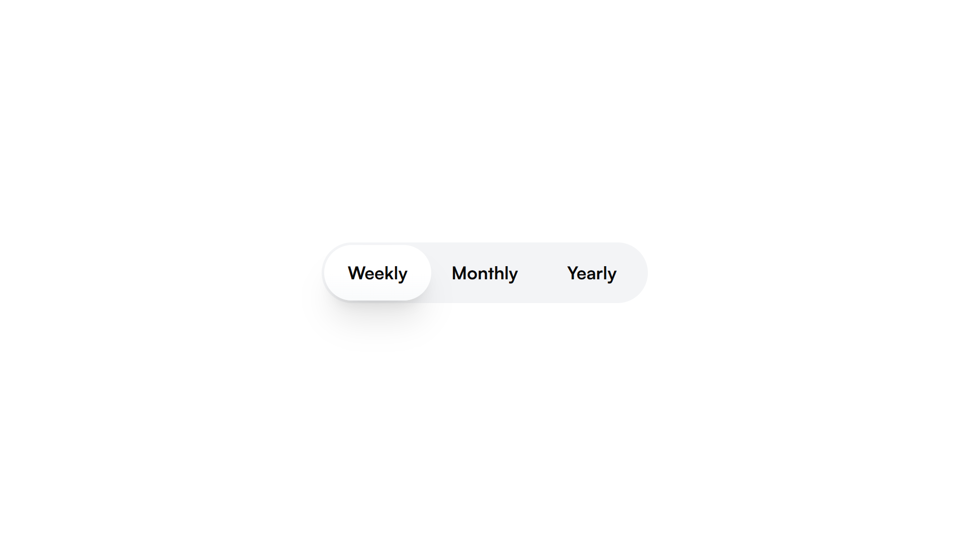
A TabSwitch component that acts as a segmented control, allowing users to switch between different options. It provides smooth transitions with a sliding indicator and supports custom styling. The TabSwitchTrigger acts as individual buttons within the switch, updating the selected value when clicked. Ideal for toggling between views or options in a UI.
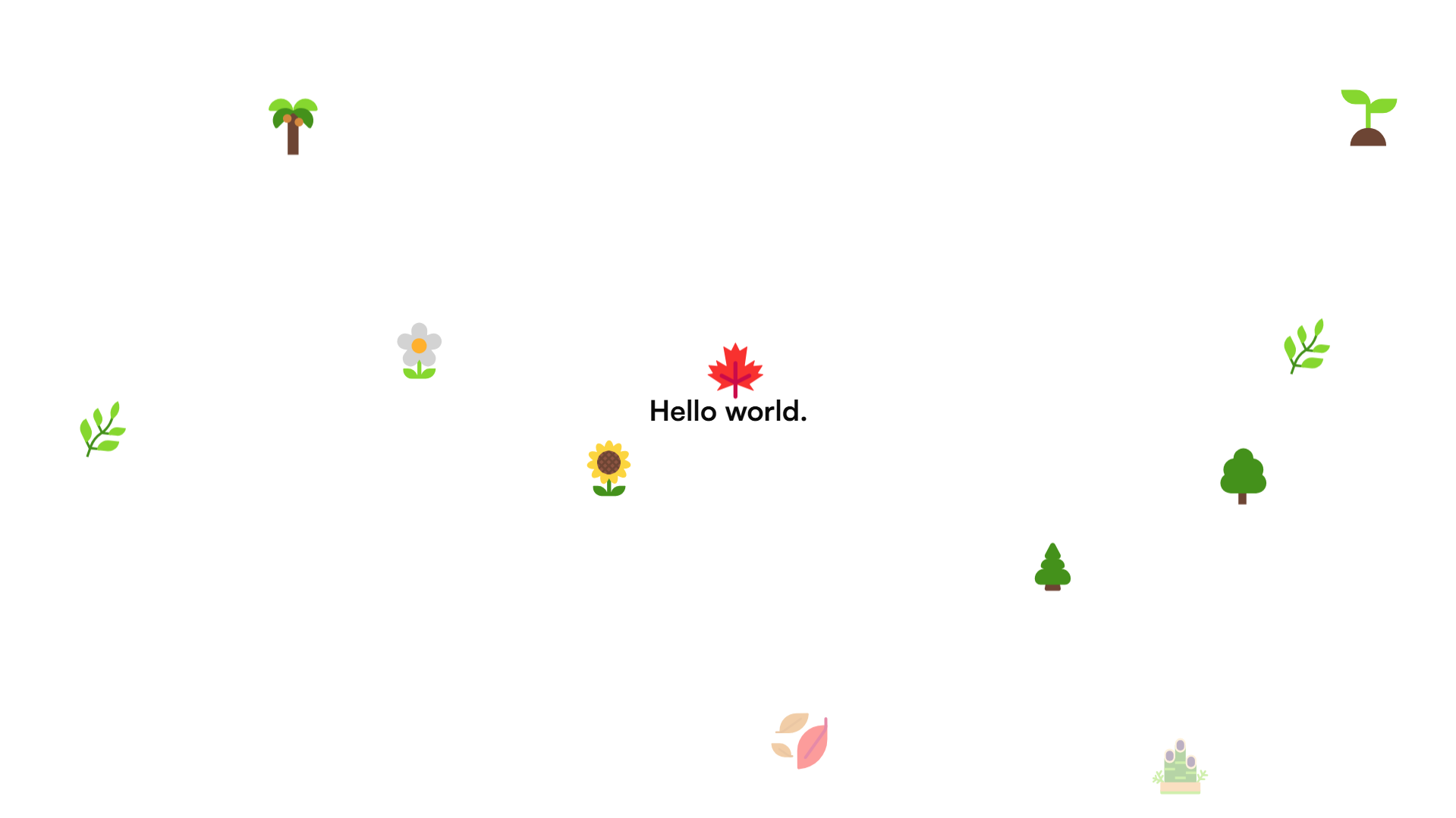
A React component that creates animated particle effects with configurable properties like speed, direction, and fade durations
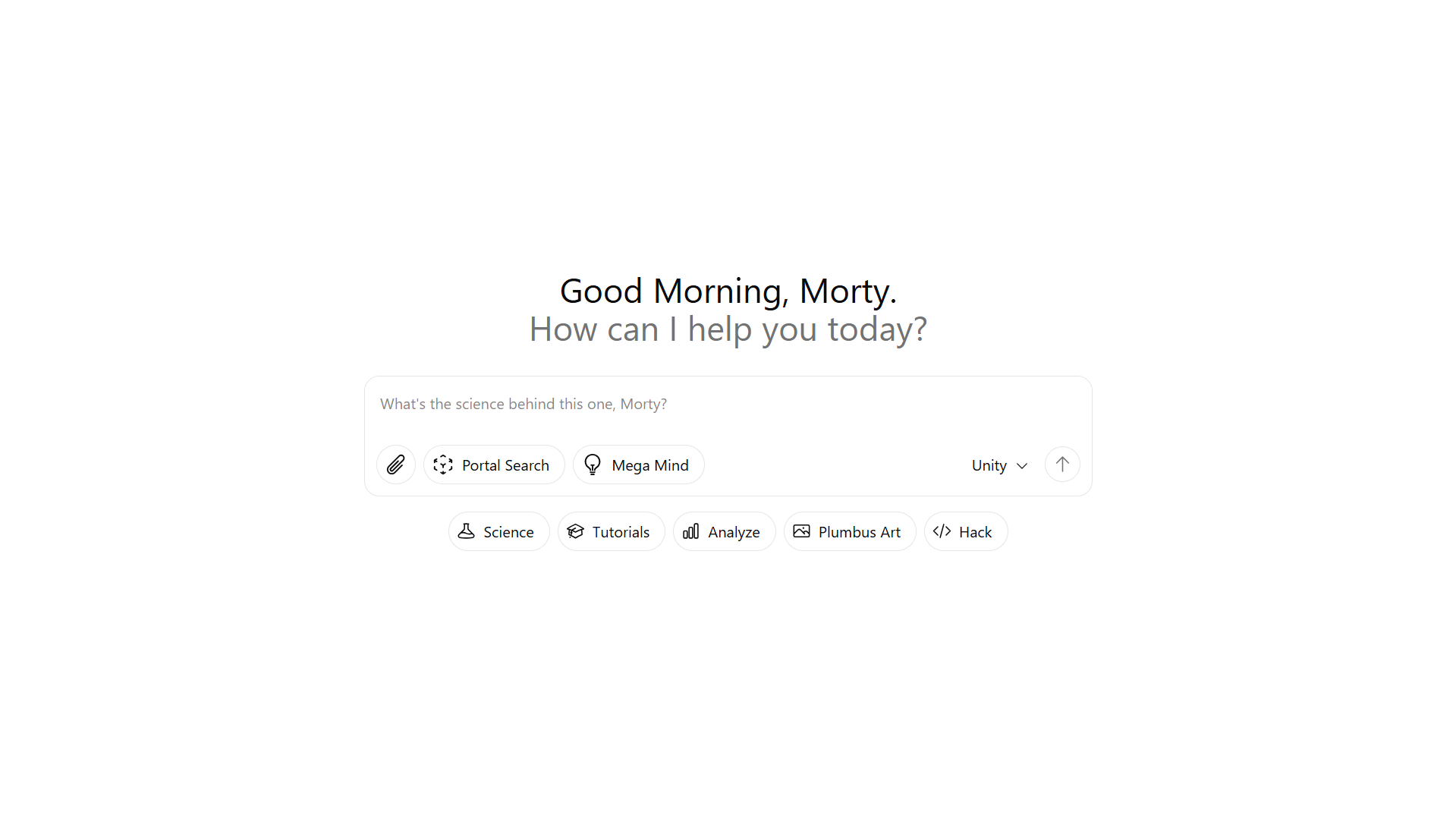
A sleek AI assistant UI with a text input box, file upload support, and quick action buttons. It includes interactive buttons for toggling different AI modes, a dropdown to select AI models, and dynamic resizing for the text area. The interface is designed for smooth user interaction with a clean, minimal look.
A powerful element showcasing customer reviews, enhancing credibility and trust for your brand.
A dynamic UI element allowing users to expand or collapse navigation options for a streamlined browsing experience.
A dynamic window displaying detailed cost information to enhance user decision-making.
Gain insights with real-time data visualization and analytics, tracking key performance metrics effortlessly.
A dynamic feature enabling users to create and share short, captivating video clips with music and effects.
Gather authentic user feedback with this powerful tool, enhancing credibility and trust in your brand.
A section providing answers to common questions, enhancing user experience and satisfaction.
Discover cost-effective solutions with transparent, flexible rates tailored to your needs.
A powerful tool for capturing and displaying user reviews, enhancing credibility and trust.
A user-friendly interface displaying various subscription plans and payment options for customers.
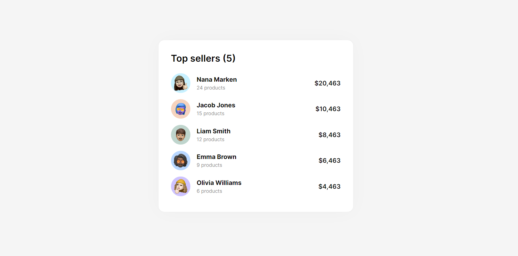
A versatile UI element for organizing data in rows and columns, enhancing readability and user interaction.
It represents achievement or prestige and is perfect for highlighting milestones or accolades in your design.
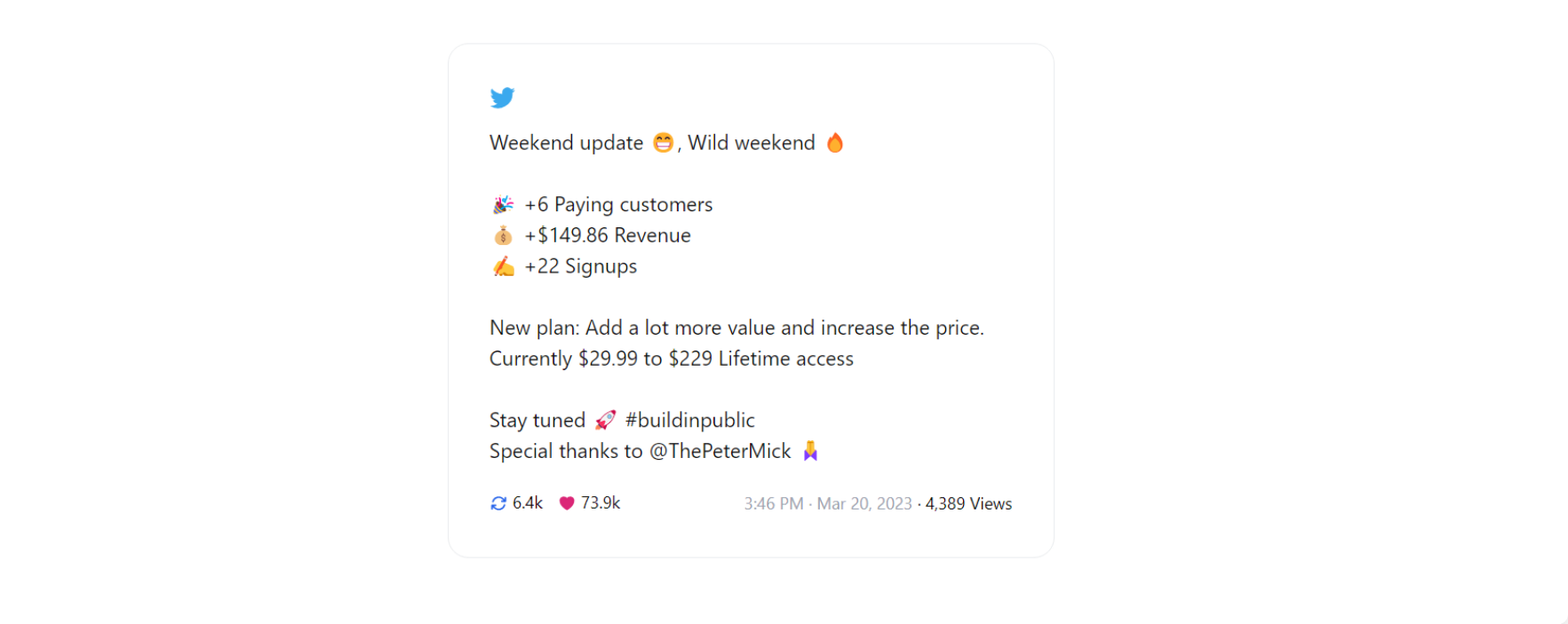
A series of interconnected tweets, presenting a cohesive narrative or detailed information, enhancing engagement.
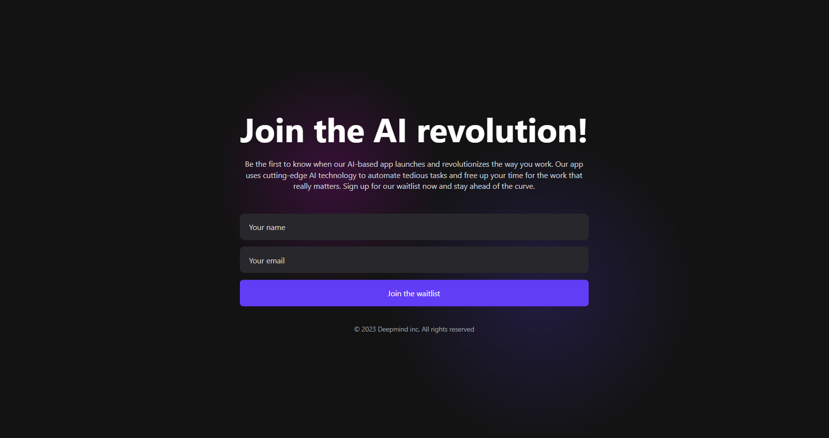
This feature-rich module enhances your website's visual impact with stunning, customizable hero sections.
A dynamic, full-width banner designed to captivate users with striking visuals and compelling headlines.
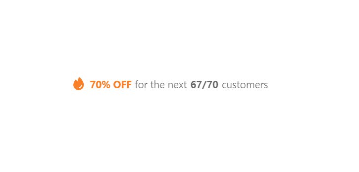
A sleek, attention-grabbing promo banner designed to drive urgency with limited-time offers and exclusive deals.
Effortlessly manage reservations and notify users with this sleek, user-friendly interface.
Showcase your new product's debut on Producthunt with this sleek, attention-grabbing badge.
Showcase your latest launch with this sleek badge, offering seamless integration and real-time updates.
Interactive visual elements featuring badges for highlighting key information and metrics.
Choose a specific individual from a list of users for tailored interactions and personalized experiences.
Easily access and retrieve files with a single click using these intuitive, user-friendly elements.
A seamless interface for real-time messaging, enhancing user interaction with intuitive design and smooth performance.
A feature that allows users to join a queue for available spots in fully booked events or services.
A concise social media post component displaying user content, including text, images, and engagement metrics.
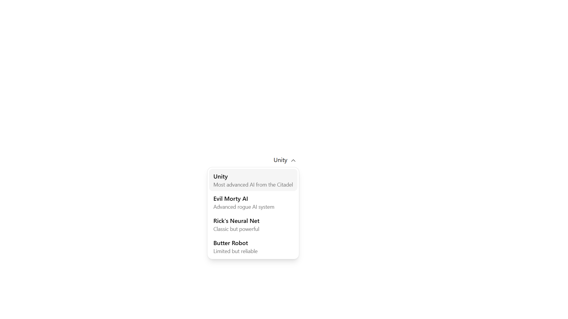
A clean and accessible dropdown menu with smooth animations, allows users to select from labeled options with descriptions.
A lightweight tool for displaying animated graphics during content loading.

.png)
.png)
.png)
.png)
.png)
.png)
.png)
.png)
.png)

.png)
.png)
.png)
.png)
.png)
.png)
.png)
.png)
.png)